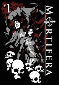
Review: Mortifera comic app #1 (GamePress)
In medieval Ireland a pair of sibling demon hunters summon a diabolic aid to help avenge their father. Not available in a new digital format, is the Mortifera comic app a devlish nightmare or a force for good?
 Publisher: GamePress
Writer: Stephan Frost
Artist: Sarah Partington
Available: £1.99/$2.99 from iTunes Store
The Mortifera comic app features the tale of brother and sister demon hunters Catherine and Ethan, whose father is murdered by diabolical demon Kanisus. In order to avenger their fathers death and stop Kanisus from raising a demon army and destroying the earth, Catherine and Ethan summon their own uber-demon Durin to stop him – fortunately for them he is loyal to their cause thanks to an ancient blood oath, not to mention a long standing grudge against Kanisus and all demon kind!
Video game designers Stephan Frost and Sarah Partington do a great job creating a strong concept for this book. The first issue is quite heavy on exposition (as fantasy world-building books often are) however once it reaches the climax then you are all set for some demon on demon destruction. Frost does a great job building the world in which his characters live with some solid ideas and a great central premise. While Partington’s manga and video game influenced artwork feels dynamic and exciting, and is reminiscent of early Joe Madureira and 90s Image, especially in the designs if the demonic bad guys.
Mortifera first saw light as a Kickstarter funded hardcover collection, so if you are a fan you wil know how the story pans out, but this latest app. Version is compiled by developers GamePress using their own Tappabl platform. Essentially it takes the static pages and adds some fancy effects (like smoke in explosions and some magical elements) as well as giving the whole thing a ComiXology Guided View style sense of motion taking the reader from panel to panel via a simple swipe.
Unlike Guided View though, Tappabl does not isolate the individual panels when navigating which causes a quite clunky reading experience for Mortifera. Parts of other panels appear on screen at the same time as you are reading, and the motion elements swirl around the page giving the whole book a sense of motion sickness rather than motion excitement. Part of the problem is the developers attempting to fit Partington’s pre-existing panels into this new format. It’s a problem we’ve seen in books such as the Madefire transfers from IDW and Dark Horse, however they seem to manage this much more seamlessly. Part of the problem may be Partington’s artwork itself as it features a variety of unconventional panel designs which make the transitions more complicated to pull off. However it is those panels which made the original comic so exciting. It’s a shame then to see this solid book actually made more difficult to read rather than easier to read and more dynamic by this new version.


