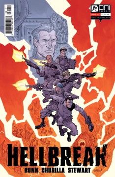
Hellbreak #1 (Oni Press)
 Alongside his work for the big two, Cullen Bunn has carved a dark and foreboding niche for thanks to supernatural western The Sixth Gun and creepy indie series The Remains from MonkeyBrain Comics. Now, alongside artist Brian Churilla and colouring legend Dave Stewart, Bunn has quite literally taken a trip to hell and back with Hellbreak #1 for Oni Press. But will this demonic team book succeed in besting his western masterpiece?
 Publisher: Oni Press
Writer: Cullen Bunn
Artists: Brian Churilla (Pencils/Cover), Dave Stewart (Colourist)
Price: £0.69/$1.00 from ComiXology
Opening with the Greek parable of Orpheus and Eurydice to help explain things, Hellbreak #1 tells the story an organisation which specialises in the retrieval of people who have been trapped and imprisoned. However, unlike most hostages and prisoners, the Kerberos Initiative helps the souls lost and suffering in Hell while their bodies are possessed. In this issue, a couple have come forth to save their son and so lead operative Jenner and his field team must journey into one of many hells and rescue him.
While the premise may seem somewhat familiar to other books which have hit the shelves in the past (Mike Mignola’s B.P.R.D especially), it is Hellbreak’s execution which helps it stand out from the crowd. Bunn does a fantastic job in this first issue as he focuses almost exclusively on the plot, giving an in-depth look as to the fundamental principle of the book, with only brief glimpses into the characters backstory so as not to bog it down. Although this means the book does lack a bit in terms of characterisation, as well as glossing over certain plot points (such as the process of reconnecting the body and soul) this is done to make room for more action, which gives the reader enough hints of what the book will be like going forward to entice them back next issue.
Bunn’s words are more than ably backed up by top notch art from Churilla and Stewart. Churilla’s panels are gorgeous throughout, with his talent shining through as he imbues the book with two distinct styles, a standard, more mainstream look for the real world and more distressed look for the hell panels, while still making them connect. While Dave Stewarts colours, look vibrant with the real world panels, and are much more pale when the team is in hell, helping sell the unsettling feeling and giving the book a nice contrast between environments.


