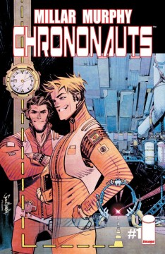
Chrononauts #1 (Image Comics)
 Whether you love him or hate him, you can’t deny that Mark Millar is pretty darn prolific when it comes to his roster of ‘Millarworld’ comics. His latest offering is Chrononauts #1, where he teams up super-hot artist/creator Sean Gordon Murphy (Punk Rock Jesus) and delves into a world of time travel hijinks. But can Millar create another ‘Kick-Ass’ story or is he out of time?
 Publisher: Image Comics
Writer: Mark Millar
Artists: Sean Gordon Murphy (artist), Matt Hollingsworth (colorist), Chris Eliopoulos (Letterer)
Price: £1.99/$3.50 from ComiXology
Dr Corben Quinn is a man on a mission in Chrononauts #1; he’s attempting to become the first time traveller and he thinks he may be on the right track. After being led to time displaced items around the world, Quinn is convinced that time travel isn’t a case of if, but when. So, with the help of his friend Dr Daniel Reilly, Quinn eventually develops time travels suits to make the pair the world’s first Chrononauts; a title which brings them much fame, even if their personal lives suffer in the meantime. However, will this pair achieve a successful trip? Only time will tell.
As you would expect from the writer of Civil War and Ultimates, Millar really has created another complex and intriguing title. The plot is tight, with a tease presented early to entice readers further before hammering out the necessary exposition to ensure they aren’t left behind. However, Millar doesn’t allow the information dump to bog down the pacing, keeping the reader engaged and allowing the story to zip along at his usual lighting pace. Of course. the romantic subplot of an ex-wife for Corben feels like an unnecessary distraction, but it doesn’t cause enough of a disruption to the overall story to be considered a problem.
While the writing is up to the standard we have come to expect from a writer of Millar’s stature, the art is more than it’s equal and reason alone to get this book. Sean Gordon Murphy brings his signature sketchy style, as crafted through Punk Rock Jesus and The Wake, to this title and it fits perfectly, – however the major new’ focus dynamic of the story does make it seem a bit too much like Punk Rock Jesus at times, but that’s now bad thing.
Unlike his prior work though the lines here feel much sharper, while the appearance of various time machines at the press conference is a real nice touch. Of course, every panel is helped by Matt Hollingsworth sublime colours. The grim and gritty nature of the tones are just beautiful and seem to mesh perfectly with Murphy’s lines, meaning these two are an artistic match that is truly timeless!


