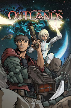
“At a time when there was minimal space sci-fi around I wanted to create something that filled the void.” Shaun Dobie talks Descending Outlands
 With the second issue of his science fiction space opera Descending Outlands set to debut at this weekend’s Melksham Comic Convention 2015, we catch up with writer and colourist Shaun Dobie to discuss Star Wars, spaceships and filling the space sci-fi void.

Tell us about the back story for Descending Outlands? What would be your ‘elevator pitch’ be for new readers?
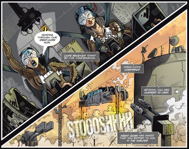
SD: What was supposed to be a simple heist gets complicated for Nate Avery and his crew of rogues in the space epic, especially when they find out the cargo they are stealing is not what it appears.
On the run from the corporate entity known as “The Fountain” who will stop at nothing to get their hands on it, and the arrival of a mysterious man with great power, the stakes have never been higher and so they are forced to hide out in a place that only thieves, opportunists and assassins dare to call home. The Outlands.
It reminded us a lot of Joss Whedon’s Firefly and of course Star Wars, what were the main inspirations you had for the series?
SD: I’ll start with Firefly/Serenity as off course that was an inspiration, its impossible to not draw comparisons against the first issue, and was an amazing piece of work that we all miss. I’ve always loved sci-fi and space travel. The vision of amazing technologies, fantastic ships, and the freedom of what can be done in that arena. More so though, i love the idea of us, now, being in that playground.

A lot of earlier sci-fi shows, such as Star Trek TNG, have humans in space surrounded by this wonder but they have all evolved with this technology and have a “futuristic” demeanor about them. What i love about the original Star Trek films, Stargate SG-1/Atlantis/Universe, Firefly, Farscape, and Star Wars (NOT PREQUELS!!!!), was the whole ‘yee-haa’ cowboys in space attitude. They portrayed the every-man that exists in our world, with our viewpoint and mannerisms, and put them in this futuristic fantastical world. Plus, who in this world has not wanted to be Han Solo, Jack O’Neill, or Malcolm Reynolds.
The original Star Wars trilogy was also a huge influence with regards to making sure that the ships, especially their ship the Everett Young, was gritty and rundown. Much like the Millennium Falcon, this is a ship of rogues, patched up with custom mods, minimal budgets and having to survive many a skirmish when things went bad.
At the end of the day, in a time when there was minimal space sci-fi around (Stargate, Star Wars, Firefly, Farscape and Star Trek had all finished), i wanted to create something that was just space fun to fill the void i felt.
You’ve worked with a variety of artists on the series, why is that? A style choice or a necessity?
SD: I am a writer and a colorist, but I cannot draw to save my life hence the need to hire artists. Over the years I have worked with many artists, but not all experiences were good. Regardless of intentions or quality, sometimes life just gets in the way and so pages get delayed or sometime never appear. I was, and still am, so passionate about Descending Outlands that I didn’t want the artists to be the bottle neck.

I wanted my story to be told.I decided early on that I wanted Descending Outlands to be more like a TV series. An overall season story arc, but split into individual episodes that could focus on specific points or characters. Much like how each TV episode can have a different director, my chapters have a different artist. Also physically splitting into chapters helps the mind deal when suddenly the artwork changes mid-story.
One of our favourite features in Descending Outlands is the quality of the presentation. Especially the design, lettering and colour work. how important was it for you and letterer Vince Hunt to put together a great looking package for the comic as well as making the pages look great?
SD: Not to undersell story, but I think presentation is one of the most important features in selling anything. Like it or not, we live in a fickle society and if someone doesn’t like the way something looks, then they normally don’t bother to even read the story to find out if it is good or not.
I’m as guilty as everyone else, being drawn to glossy cover art like a magpie, but then full of disappointment as I open it up to find the polar opposite inside.
I take pleasure in making sure that everything I create look as professional as possible. Also the more professional I can make it, the less likely people are to think its just a low budget small press comic. That then gives them confidence in it and helps persuade them to give it a try in the saturated market, bursting with variety and talent.
Has digital colouring improved or reduced the quality of small press comics?
SD: I think colour, if done right, can completely change a comic. Elevating it from the pages and allowing you to set tone, clarity and focus in ways that you cannot do with inks alone. Saying that, i have seen a lot of poor colour attempts, which i feel do the opposite. If you have a poor colourist then sometimes black and white art would probably have looked nicer.

Do you have any tips or words of wisdom for aspiring colourists and do you think the average reader notices and appreciates it?
SD: If there is anyone that wants to get into comic colouring, then my best advice would be to practice and don’t be afraid to use references. When you start, its hard to know how and where light falls on a face or object, as such find images to use as reference to show you.
Often i find myself doing silly things like shining a light on my face while looking in a mirror to see what it looks like from a specific angle….references are not cheating, so use them. Also after you have drawn light hitting a face for a while, it will then become instinct and you will not need references in future.
Also patience is key. Flatting and then shading a detailed sequential page can easily take a few hours, so be prepared for that.
My final advise to colourists is to experiment. You don’t have to make every coming photorealistic. Some of the best looking ones have a style all to themselves. Some stay with black and white, but use an extent colour such as blue or red to make panels pop, where as some stick to simplistic animation style cell shaded look. It all depends on the artwork, and style you want to give your comic.
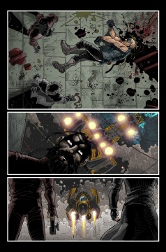
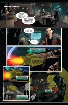
With Descending Outlands I wanted to give it a gritty, realistic feel so there is lots of browns and rusty looking areas juxtaposed against beautiful scenic space scenes, whereas with The Red Mask From Mars, creator Vince Hunt wanted a more vibrant, simplistic, Sunday morning cartoon look to it.
Tell us how the book is available and where people can get it from – in particular how is it available digitally, why did you choose that outlet and does having it available digitally help spread the word to a larger audience?
SD: Both issues are available as print or digital download and is currently in the review process of Comixology. I have found that digital is good for reviewers mainly and that with small press people prefer to actually have a physical item. Most sales from from conventions themselves.
However, on the website is a free online version of Chapter 1, which people generally read and then decide to purchase the comic itself :
Find out more about Descending Outlands online at www.


December 20, 2025 @ 4:42 pm
Das Besondere an diesem Slot ist das Bonusspiel, das bei drei oder
mehr Bonus Symbolen aktiviert wird. Hier werden Sie eine Liste unserer vorgestellten Spielautomaten-Spiele finden, quasi
unsere Top Auswahl im Moment. Sie möchten sicherlich keine Zeit daran verschwenden Software herunter zu laden und zu installieren und es ist sogar sehr wahrscheinlich verboten,
wenn es ein geteilter Computer ist. Egal, wie viele Spieler sich gerade in unserem Casino tummeln, und egal,
wie viele Automaten gerade in Betrieb sind –
Slotpark ist und bleibt kostenlos.
Um Spielautomaten kostenlos zu spielen, besuche unsere Seite, wähle deinen Lieblingsautomaten und beginne zu spielen.
Diese Spiele bieten den Komfort, ohne die physische Anwesenheit von Gegnern zu spielen. Ja,
du kannst die meisten Echtgeld Slots kostenlos im Demo Modus
spielen. Bevor du echtes Geld einsetzt, kannst du in der Regel auf jeder Glücksspielplattform Casino
kostenlos spielen.
Auf unserer Seite finden deutsche Spieler Demoversionen von Spielen, die von Softwareentwicklern zu Informationszwecken bereitgestellt werden. Deutsche Spieler genießen insbesondere Freispiele in Bonusrunden,
weil sie es ermöglichen, deine Gewinne mehrmals zu vervielfachen, ohne Credits auszugeben! Online-Poker und Tischspiele stellen eine Form der
Unterhaltung dar, die über das Internet für deutsche Spieler spielbar ist.
In der modernen Welt der Online-Casinos in Deutschland heben Bonus-Spielautomaten das Glücksspiel zu einer Kunstform, indem sie deutschen Spielern weit mehr bieten als nur das Drehen der Walzen.
References:
https://online-spielhallen.de/nine-casino-mobile-app-erfahrung-dein-kompletter-guide/
December 21, 2025 @ 2:26 am
Sie können einen Willkommenspfad wählen, der zu Ihnen passt,
wie ein Match an Spielautomaten, Freispiele oder Cashback.
Mit Visa-, Mastercard-, Sofort-, Giropay-, Skrill-,
Neteller-, Paysafecard- oder SEPA-Überweisungen können Sie Ihrem 7signs Casino-Konto Geld hinzufügen. Sobald Sie zur Auszahlung bereit sind, wählen Sie eine Zahlungsmethode aus, die Sie bereits verwenden, um Dinge online
zu kaufen. Kommen Sie zu uns und genießen Sie eine Lobby, die speziell für Mobilgeräte konzipiert wurde und
Tausende von Spielen aus Top-Studios bietet. Erstellen Sie
ein Konto, wählen Sie ein Thema für Ihren Avatar aus und verfolgen Sie Ihren Fortschritt bei Missionen, um
zusätzliche Leckereien zu erhalten.
Bonusbeträge, die durch diese Aktion erzielt werden, unterliegen einer
35-fachen Umsatzbedingung auf die Summe der Einzahlung
und des erhaltenen Bonus. Der zweite Einzahlungsbonus beträgt 75 % bis zu 300 EUR, 450
CAD oder 300 USD. Um den Bonus für die erste, zweite oder dritte Einzahlung zu
erhalten, muss der Spieler einen Mindestbetrag von 20
EUR, 30 CAD oder 20 USD einzahlen. Die Magic
Coin-Funktion bietet den Spielern während des Spiels Gewinne von bis zu 1.000 €.
References:
https://online-spielhallen.de/starda-casino-freispiele-ihr-schlussel-zu-unterhaltung-und-gewinnen/
December 26, 2025 @ 12:12 pm
Overall, the community feedback aligns with the
operator’s transparent approach to both promotions and security.
Online forums tend to discuss the helpfulness of customer support, especially regarding problem resolution. Word of mouth often complements official ratings when assessing a
platform’s reputation. Furthermore, certain campaigns
also feature Fair Go Casino Free Spins, allowing extra opportunities on selected pokies.
Coupled with the numerous game choices, this makes the welcome experience
truly memorable.
If the normal reset process doesn’t work, you can get help directly from the official
Fair Go Casino support page. Have relevant details ready, such as account email, recent payments in $, and screenshots
of error messages, to speed up troubleshooting and verification. For unresolved problems,
Fair Go Casino provides 24/7 live chat and email support.
Occasionally, Australian users encounter obstacles when trying to access their
Fair Go Casino profiles.
References:
https://blackcoin.co/ufo9-casino-your-place-to-play-your-way/
December 26, 2025 @ 4:22 pm
Live – online chat @2023 Ripper Casino encourage responsible gaming.
Play on desktop, tablet, or mobile with a stable
internet connection. Our Ripper Casino review
experts tested the site on various devices and found that it is a great mobile
casino. Ripper Casino does not have a mobile app but is compatible with both Android and iOS devices.
When Ripper Casino Online launches a new game, it’s always a celebration!
These pokies pool a portion of every bet into a growing jackpot until one lucky punter scoops the lot.
They’re simple to play but nerve-wracking in the best way.
With thousands of pokies spanning a wide range of themes, mechanics,
and features, it’s a spinning paradise for any
slot fanatic. Let’s take a deeper look at the main game categories Ripper Casino offers.
Here’s a clear and honest rundown to help you decide if this is your next go-to gaming
spot.
References:
https://blackcoin.co/playamo-casino-safe-online-casino-in-australia/
December 26, 2025 @ 4:35 pm
No judgment – we want everyone to have a good time.
Sometimes, the site’s weird, or you can’t remember which email you used,
or whatever. Fair Go Casino has announced plans to implement additional login features in the
coming months, including biometric authentication options for compatible
devices.
Use Neosurf or Bitcoin to make deposits to increase your
promotional revenue. To get a thorough perspective, you can go further into the
specific data like RTN, volatility, features, pay lines,
and bonus rounds. It’s imperative to pay attention to the subtleties, which are frequently learned via evaluations, in order to thrive in the world of gaming.
We see our progressive jackpots, which are offered for both
poker and pokies, as the cherry on top.
At FairGo Casino Australia, there’s always something exciting happening to boost your gameplay and keep the fun going strong.
The diverse game library at Fair Go Casino ensures that everyone can find something they enjoy, all within a secure and player-friendly environment.
If strategy and skill are your thing, Fair Go’s table games selection won’t disappoint.
For those who love spinning the reels, Fair Go online pokies are a treasure trove of fun and rewards.
The games listed under each section will be posted below the text for easy access and browsing.
Join the chorus of satisfied winners today and discover why
Fair Go stands as a beacon of excellence in the Australian online gaming landscape.
References:
https://blackcoin.co/playzilla-your-ultimate-pokies-destination-in-2025/
December 27, 2025 @ 6:57 am
Nowhere else can you share the experience of Darwin’s best Italian food, Italian wine, good times, and
great views! The Superior Lagoon rooms offer a private sanctuary amid a tropical paradise.
These rooms offer a private balcony with an outdoor setting
with sweeping picturesque views of the lagoon. Nestled
amongst the resort, located on the first floor, the Lagoon Rooms offer
a deluxe king bed or 2 queen beds, separate luxury bathroom, state of the art flat screen TV and mini bar.
Relax on the expansive balcony with day bed, sun lounges, outdoor shower and direct access to the glistening lagoon pool.
The Mindil Suite features generous living area with six-seater dining table, butler’s pantry with kitchenette, powder room, dressing room and oversized double bathroom
with a free-standing bath, television and separate shower.
Each room also includes a private patio, offering spectacular garden or ocean views.
Located on the ground level of the hotel, these spacious rooms are fully equipped
with a Japanese-inspired spa bath and a separate spacious corner shower.
Superior Spa Rooms offer guests the ultimate relaxation experience.
All rooms feature a private balcony, stylish ensuite bathroom, complimentary WiFi
and a state-of-the-art flat screen television. The Garden Grand Suite
offers guests an experience to remember. Use your points for
Xtra Credits, dining, hotel stays and more.
References:
https://blackcoin.co/fair-go-casino-login-guide/
December 28, 2025 @ 10:44 pm
online casino mit paypal einzahlung
References:
wedeohire.com
December 28, 2025 @ 11:22 pm
paypal casino online
References:
cybernetshell.com
December 29, 2025 @ 5:35 am
us online casinos that accept paypal
References:
https://www.ahrs.al/punesimi/our-favorite-paypal-casinos-2025-ranking-update
December 29, 2025 @ 6:01 am
paypal casino online
References:
cello.cnu.ac.kr
December 30, 2025 @ 12:50 am
us online casinos paypal
References:
https://tsnasia.com/employer/play-21000-free-online-casino-games-no-download/
December 30, 2025 @ 1:09 am
paypal casinos online that accept
References:
https://eduxhire.com/employer/new-online-casinos-for-january-list-of-latest-us-casino-sites/