“It’s all down to the denizens of a little corner of north London with their beehives and big quiffs!” Nick Prolix on the appeal of making cockney webcomics for Slang Pictorial and the perils of Kickstarter
We’ve been huge fans of Nick Prolix’s retro cockney webcomic The Sheep And The Wolves since it was a few pages old, but this month sees him return to Kickstarter with a new volume of Slang Pictorial. We catch up with Nick to find out why he has braved Kickstarter once again, as well as discuss the development of his retro style through the plethora of projects he’s been working on in the past year.
You are launching a new Kickstarter for Slang Pictorial this week, are we right in thinking this is your first foray into crowd-funding? So why make the leap for issue #3?
NP: It’s my first time on Kickstarter as a creator and in fact last year was my first time even backing a project on the platform. Initially I was going to just run a very limited two week campaign just as a way for folks who are already reading Slang Pictorial to pre-order issue 3. When I asked a few other small pressers on Twitter about it tho, they really opened my eyes to the possibility of using Kickstarter as a way to find new readers which I hadn’t really considered before. So that’s the hope with the Kickstarter, that I can reach some folks who haven’t seen my work or heard of me before.

For those who might be new to the world of Slang Pictorial, can you tell us a bit about what it is and who the characters are?
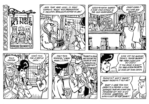
NP: Slang Pictorial is the name of my one-person anthology comic in which I am serialising an ongoing retro comedy-drama called The Sheep And The Wolves. The Sheep And The Wolves follows the highs and lows in the lives of the residents of a fictional north London neighbourhood in the early 1960s. We follow Jimmy Angel, a wide-boy with delusions of infamy and a huge quiff as he tries to get ahead in the local underworld, his new girlfriend Linda Lemon, a machinist in a dress factory dealing with an overprotective father and an overly amorous boss and in issue 3 we meet Ida Darling, intrepid reporter on the local rag as she tries to bust a dope ring in a seedy jazz club. By my last count at the end of issue 3 we’ve been introduced to 40+ characters and the list keeps growing!
You’ve been working on a number of other projects this year, including Awesome Comics, your own sketch book and also the Flying Halfpennies for the Nottingham Comic Con anthology, have you enjoyed broadening your range of work? It really looks like it has helped you improve and develop your style!

NP: Thanks! Working with Tony Esmond on Cockney Kung Fu has been phenomenal, he’s a great collaborator and a gent and it’s been great developing a more kinetic style that really suits the raucous energy of his writing. The Flying Halfpennies, my all-ages adventure strip about a pair of feline pilots in the South Seas has been a chance to swing completely the other way in terms of being able to tell stories that my kids can read and enjoy.
Do you use much in the way of source material to get the look and feel of the strips correct?
NP: I watch a lot of film and TV looking for interesting period locations and fashions to crib from, as well as novels from the 1950s and 60s. I’m always scribbling down snatches of slang or interesting anecdotes from biographies or non-fiction books that could eventually find their way in some shape or form into The Sheep And The Wolves. I’ve also recently discovered the world of retro and vintage fashion bloggers and instagrammers who are a fantastic source of reference photos for period specific togs!
Your work seems to be getting more ambitious and more complex as you get more confident – would that be fair to say. Some of the hand lettering work you did in Awesome Comics was amazing. Do those ideas evolve as the artwork develops, or do you have to plan them out ahead of time and know you are going to be doing a piece with complex lettering in before you start?
NP: I think the ambition has always been there, but perhaps now my skill level is beginning to get to a point where I can execute on those ambitions a bit more consistently. Like everybody tho, I’m a long way off where I would like to be in terms of my cartooning and my visual storytelling. In terms of how my ideas develop, I’m still a big advocate for improvising on the page involve a lot of discovery through the act of drawing, which does often end up in a lot of rubbing out and re-drawing too!

You’re still hand lettering and properly inking everything, is that quite a labour intensive process? Or is it necessary one to get that vintage feel to the book?
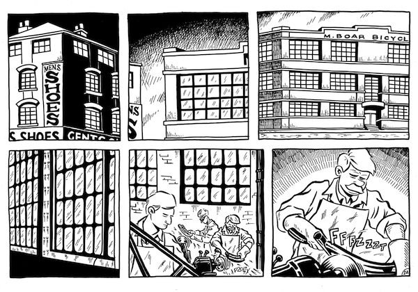
NP: It’s not quick for sure, but how much of that is the techniques or just my own fairly slow pace I can’t say. I letter and ink by hand because I do want to emulate the look of classic newspaper strips which is also why the comic is in a landscape format. To be honest I am always looking for ways to speed up my process, for example I used to scan my pencils then print them out in blue on bristol board in order to ink but for this issue I have switched to using a big A3 light box and using that to ink which cuts out the need to scan the pencils entirely, so that has sped things up a bit. As with all these things, you see another creator do something and you think I can steal that, add it to my toolkit, so with the lightbox it was seeing how Rich Tomasso used one to ink Spy Seal which encouraged me to switch up my process a bit. I sometimes wonder if everything wouldn’t be easier with a Cintiq, but I kind of like not being able to hit CMD-Z and fix every little mistake. Pen and ink does kind of keep you honest… and there’s always white-out for when things go really wrong!
That vintage feeling seems to follow through into the production values as well as you love to make books with a really great tactile and classic quality. Is print still important to you as a creator?
NP: Totally. I have been reluctant to make my work available digitally anymore, I’m not on Comixology or Comichaus, for example, although I do read a lot of comics so I am fairly ambivalent about things. I was going back and forth a bit between having a digital bundle tier for the Kickstarter at all and I may decide in the future to just keep things purely digital next time, but we’ll see, if folks say they enjoy the digital versions then I guess they’ll be here to stay.

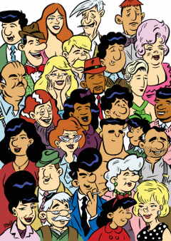
We love the print you’ve included with all the character sat in the cinema – are we right in thinking that was inspired by Love and Rockets? What else is inspiring you these days? We can see quite a bit of Stranski influence on your work!
NP: Lorenzo Etherington’s Stranski is the book that got me to finally pledge to a Kickstarter, and his line, his work ethic and his attitude have all been a massive inspiration to me for sure. And the yes you are spot on that the print I’m offering exclusively on the Kickstarter is my homage to the wraparound cover of Love and Rockets #50. I came to Love and Rockets really late and firstly through Gilbert’s Palomar stories but recently I’ve been reading Jaime’s Locas stories for the first time and they are just so good. What else have I been reading lately? Dungeon by Lewis Trondheim and Joan Sfar, Olivier Schwartz and Yann’s Spirou albums are amazing even with my pitiful French. Russell Mark Olson’s Gateway City is a small-press gem and if we get to stretch goals there’s some fantastic artwork that Russell has worked on which I can’t wait to share.
You’ve been a regular at a lot of the conventions we’ve been to this year, what have been some of your highlights and how important to you are conventions and getting out there to meet the people?
NP: I did ten conventions last year and I had a great time connecting with readers, meeting new creators and recognising some familiar faces as I got out and about more. Highlights for me have been all those times folks have returned after having bought issue one at one con to get issue two next time they’ve seen me. I’ve had a lot of love from small press folks and it really is a blast to think it’s all down to the denizens of a little corner of north London with their beehives and big quiffs!
And finally, give us one last sales pitch and tell people why they should be backing Slang Pictorial?
NP: If you like your cartooning like you like your British movies, classically black-and-white and resoundingly retro then Slang Pictorial is the comic for you! That and there’s even the chance to see yourself as a cameo in this very issue!
You can back the Sland Pictorial #3 Kickstarter here. And you can find out more about The Sheep And The Wolves and Nick’s other work here.


October 8, 2025 @ 8:22 pm
I’ll definitely be coming back for more. Watch live score ptv sports — schedules and scores. fast, reliable HD streaming. match previews, expert commentary, replays. fast, reliable HD streaming.
February 3, 2026 @ 4:32 am
https://askoff.ru
February 3, 2026 @ 5:21 am
https://askoff.ru
February 3, 2026 @ 5:22 am
https://askoff.ru
February 3, 2026 @ 5:24 am
https://askoff.ru
February 3, 2026 @ 9:19 am
https://asklong.ru