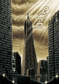
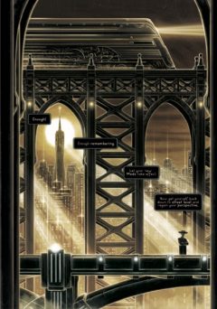
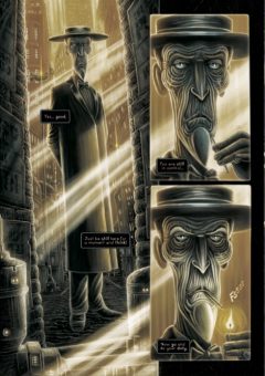
“I wanted it to have the look of a lost film from the early days of cinema” Martin Simpson on creating Art Deco noir in The Needleman
 Having been blown away by the Art Deco noir of Martin Simpson’s The Needleman from Soaring Penguin Press, we knew we had to find out more! However when we caught up with Martin, we were a little bit more gentle with our interrogation than Rasp, the sinister investigator and titular Needleman who uses a long spike to get info out of his victims. And we think we got better answers as a result!
 We were hooked into the world of The Needleman from the minute we saw the iconic cover on a copy of Soaring Penguin’s anthology Meanwhile – can you tell us a bit about how the idea came about and how you created this really interesting character?
Martin Simpson: Well you nailed it in your review when you mentioned Fritz Lang’s Metropolis… the whole of The Needleman is a response to me watching that film for the first time a few years back. It really struck me visually… I loved that vision of the future as seen through the lens of 1920’s Germany and it’s themes of slavery and capitalism gone mad.
There was also one character in particular that interested me… he’s actually a rather incidental henchman called ‘Der Schmale’, or ‘The Thin Man’ and for some reason, I decided to try and build a story around him. It all started to evolve from there really.
We love the Art Deco style imagery you have and you mention Metropolis above, but were there any other books or films or art styles that inspired this world, and why did you choose that visual style?
 MS: The visual style all spun out from Metropolis… and German expressionist cinema in general. I wanted it to have the look of a lost film from the early days of cinema… right down to the subtle dust and scratches you can see over the pages.
Films like Bladerunner and even the slightly obscure THX-1138 were big influences too… as was the brilliant Batman The Animated Series from the early 90’s. Outside of cinema, there is definitely a little V for Vendetta and Orwell’s 1984 in there too.
Can you tell us a bit about your creative process for creating the artwork? Are you all digital?
MS: I paint 100% in Photoshop, using a large Wacom tablet (I prefer it to a Cintiq)… but I also apply a lot of more traditional media to create all kinds of sketchy and painterly effects. I can never get on with any kind of custom texture brushes in Photoshop… so I almost never use them.
In the back of the book you include some grabs of using a 3D software to get Rasp’s look right, can you tell us a bit about that?
MS: I remember once listening to an interview with INJ Culbard about how he recommended creating rough busts of his principal comics characters in Sculptris for reference. It was great advice… Sculptris is free to download and really intuitive to use… I’ve found it’s a brilliant way to help keep my character designs consistent throughout a story. It can be really easy for the look of characters to unintentionally shift about… especially when you’re doing painted comics.
And how labour intensive is your style to produce?
 MS: Let just say… VERY! But that’s comics in general for you.
The colour in the book is amazing. I love the golden yellow hue you give everything that makes it shine and feel golden when contrasted with the dark heavy shadows. Then you contrast that with the amazing multi-coloured pages in the middle – which I would love to hear your thoughts on, but without giving too much away!
MS: Hey thanks very much! The colour for this book was a difficult nut to crack. I wanted a limited colour palette to signify how limited this world is for the people that live within it. That way, when the multi-coloured section of the story kicks in, it’s a really dramatic contrast and becomes something that a man who has lived his entire life in this limited palette world would find overwhelming.
This collection reprints the pages that originally appeared in Soaring Penguin’s Meanwhile, can you tell us a bit about how that relationship came about, and have you had to change any of the pages for this new edition?
 MS: I was a fan of Meanwhile… I really wanted to be part of it… so I submitted some work to them. A conversation then started between me and John Anderson (the founder of SPP) that lead to me submitting a script that was originally titled ‘The Thin Man’. Cleverly, and without ever actually telling me what to do, John got a couple more re-drafts of the script out of me and asked me to change the title to something else… hence I went for ‘The Needleman’. Then I did a full sketched layout of the story for him and he approved it.
The Needleman was originally published in two parts in issues 8 and 9 of Meanwhile. When the possibility of this collected edition came around, I produced a new cover, generally re-worked every previous page and added three extra pages of art. I also did a little tweak to the script and overall colour palette too.
And finally, is this a one and done for the world of The Needle Men, or will we see more from this world?
MS: It was originally written as a self contained one-shot… but almost as soon as I finished the first script I started to have ideas about a continuation and definite conclusion to Rasp’s story… and Soaring Penguin Press have expressed interest in me doing some more work for them… so… maybe. But I’ll have to see how this one goes down with people first!
You can find Martin at Table 61 in the Originals Marquee at Thought Bubble 2018 and you can see more of Martin’s artwork at martinsillustration.com/projects and follow him on twitter @SIMO_Paints


October 9, 2025 @ 12:13 am
One of the best reads I’ve had this week. Watch live ptv streaming sports — expert analysis and updates. quick start and smooth playback. interviews, results. mobile and desktop friendly.
December 20, 2025 @ 10:21 am
Um mit dem Geld garantiert einen riesen Gewinn zu machen, hat er bereits einen Plan.
Regie führte Martin Campbell der 1995 bereits GoldenEye mit
Pierce Brosnan in der Hauptrolle inszeniert hatte. Von EON produzierte “offizielle“ Bond-Film aus
dem Jahr 2006 und basiert auf dem gleichnamigen ersten Bond-Roman von Ian Fleming aus dem Jahr 1953.Mit diesem Bond-Film wurde ein Neustart des 007-Filmkosmos vorgenommen, somit gilt er auch als erster Teil
der Bond-Reboot-Reihe. US $ Chris Cornell -You Know My Name Martin Campbell Neal PurvisRobert
Wade Barbara BroccoliMichael G. Wilson Phil Meheux Stuart Baird
David Arnold Daniel CraigJames BondEva GreenVesper
LyndMads MikkelsenLe ChiffreCaterina MurinoSolange DimitriosSimon AbkarianAlex DimitriosJudi DenchM (Olivia Mansfield)Jeffrey WrightFelix LeiterGiancarlo GianniniRené
MathisIsaac de BankoléSteven ObannoJesper ChristensenMr.
James Bond Casino Royale ist ein Agentenfilm aus dem Jahr 2006 von Martin Campbell mit Daniel
Craig und Eva Green. „Rasante, in Details durchaus raue Verfilmung
des ersten James-Bond-Romans von Ian Fleming, die sich durch betonte Körperlichkeit
und artistische Kabinettstückchen auszeichnet.
Für den Geheimagenten wurden über 200 Darsteller in Betracht gezogen, darunter die
Australier Karl Urban, Sam Worthington und Hugh Jackman sowie der englische Henry Cavill.
Bereits kurz nach Veröffentlichung des Romans
Casino Royale verkaufte Autor Ian Fleming die Verfilmungsrechte an den amerikanischen Fernsehsender CBS,
der die Geschichte für eine 1954 veröffentlichte Episode
der Serie Climax!
References:
https://online-spielhallen.de/die-betano-casino-mobile-app-dein-komplettpaket-fur-unterwegs/
December 27, 2025 @ 7:06 am
This fact in itself proves that we are a fair casino, that’s why top
providers cooperate with us. Casino-Mate provides the services of many software vendors, including such
a titan in the world of gambling as Evolution Gaming.
Our Casino-Mate website was launched in 2011 and has been providing gambling services for Aussies for over 10 years.
Whether you’re new to online casinos or a seasoned punter, Casino Mate delivers an authentic Aussie experience with local payment options, strong data protection,
and tailored bonuses that make every spin worth it.
Mobile gambling is having a similar effect on the online
gambling world, giving players the chance to experience
their favourite casino games from anywhere. We take a look at
the new and improved Casino-Mate to review its bonus offers, software, game variety, deposit options,
customer service, security and more to see
if this time-honoured casino site is still up to scratch.
Mobile games are fully HD optimised so there is
no compromise to the high quality of the games and mobile players
still enjoy access to all the same welcome bonuses and loyalty points.
Online Roulette – utilising the best in gaming software to provide roulette games that
maintain the excitement of playing in a real casino, Casino-Mate’s online roulette is the best way to enjoy this casino classic from the comfort of
your own home.
Participants who deposit AU$20 or more on Wednesdays are rewarded
with 20 free spins on a featured pokies game.
Scratch cards, on the other hand, deliver instant gratification with simple gameplay mechanics—just scratch and
reveal. Offering a choice of live options, these titles are hosted by professional dealers and streamed
in high-definition video for a truly immersive experience.
The venue elevates the online playing venture with its
state-of-the-art live dealer titles. This collection includes
all-time favorites available in various versions to
keep the gameplay fresh and exciting.
References:
https://blackcoin.co/new-online-casinos-australia-2025-guide/
December 27, 2025 @ 1:49 pm
Check our responsible gambling page for more information about
how to manage your bankroll and make sure you stay in control when playing.
This is why I suggest you either time your sessions or take breaks in between games.
Some games can be immersive, and you can easily lose track of time.
When you’re gambling online, an unstable connection is problematic, so I suggest upgrading your plan or switching providers if your internet isn’t stable.
No round-trip to casinos, no dressing up, and you don’t even need to be on a PC.
From generous bonuses to thorough game libraries,
these online sites cater to all types of players. There are many online casinos to consider, but here are our 5 best picks for Australian players.
These bonuses typically include bonus money upon your first deposit,
free spins for slot games, and opportunities
to play without any initial deposit. Yes, you can withdraw money from online casinos
in Australia, particularly from those that offer secure methods like
PayID, which enables fast payouts. Top legitimate online casinos offer tools like deposit limits, self-exclusion, and reality
checks. So if you’re on iOS or Android, the best real money casinos offer seamless,
secure and explosive gameplay optimized for touchscreens.
References:
https://blackcoin.co/sg-casino-a-comprehensive-review/
December 29, 2025 @ 5:42 am
online pokies australia paypal
References:
https://praylotto.kr/bbs/board.php?bo_table=free&wr_id=6
December 29, 2025 @ 5:59 am
online casino for us players paypal
References:
https://karierainsports.gr/employer/top-paypal-casinos-in-the-us-2025/
January 27, 2026 @ 7:35 pm
**mitolyn reviews**
Mitolyn is a carefully developed, plant-based formula created to help support metabolic efficiency and encourage healthy, lasting weight management.
February 6, 2026 @ 11:46 pm
business wireless plans [url=https://otvetnow.ru]https://otvetnow.ru[/url] donation truck
February 8, 2026 @ 8:53 pm
https://askoff.ru